Ever feel like your inbox is a chaotic digital marketplace, a relentless torrent of newsletters, promotions, and automated updates? You’re not alone. The average email inbox in 2025 might be noisier than ever before, but here’s the kicker: email marketing is far from fading. In fact, it’s evolving. And for savvy marketers like us, that evolution means focusing on relevance, not just volume. Want to know a secret? Email still delivers one of the highest returns on investment (ROI) of any digital channel out there. The real challenge, then, isn’t whether to do email marketing, but how to do it right. And it all starts with one crucial element: getting the right people onto your list.
So, how do we cut through the noise and build a high-quality, engaged email list in this hyper-competitive landscape? Forget those clunky, annoying popups from 2010 that made you want to rage-click the ‘X’ button. We’re talking about a whole new breed of popup – one that’s intelligent, user-centric, and unbelievably effective. In this deep dive, we’re going to pull back the curtain on how to use popups the smart way, based on real user behavior, not just guesswork. From irresistible welcome offers that actually convert to perfectly timed triggers that appear at the exact right second, we’ll break down what’s working right now and what’s coming next in the world of conversion-focused popups. Ready to transform your email list building strategy?
Redefining Popups: The 2025 Advantage
Let’s be honest: many of us still wince at the word “popup,” picturing those jarring, full-screen interruptions that blocked our view and instantly soured our website experience. But the reality in 2025 is refreshingly different. Modern popups aren’t about mere interruption; they’re about impeccable timing and meaningful context. Think of them less like a telemarketer calling you during dinner and more like a helpful concierge appearing exactly when you need assistance.
When executed with finesse, a popup appears because there’s a genuine reason for its presence. Imagine this: a visitor is about to leave your site, having spent precious minutes browsing, or perhaps they’ve just scrolled through an entire, detailed guide you’ve published. Or maybe they’ve simply been inactive for a few moments, a subtle signal they might need a gentle nudge. In these precise moments, a well-crafted popup isn’t an annoyance; it’s a valuable opportunity. These strategically placed, behavior-triggered popups consistently outperform passive elements like static signup forms buried in your footer or unassuming calls-to-action on a sidebar. Why? Because they meet your users where they are, when they’re most receptive.
The Power of Personalization and Smarter Tech
What makes this seismic shift possible? It’s the relentless march towards hyper-personalization and sophisticated underlying technology. A modern popup isn’t a one-size-fits-all digital billboard. Today, a popup can greet a returning user by name, a small touch that instantly builds rapport and recognition. It can offer content that’s directly relevant to their browsing history, transforming a generic offer into a tailored solution. Moreover, these smart popups can visually adapt to your website’s unique design and branding, making them feel like an integrated part of the user experience rather than a jarring overlay.
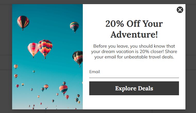
And let’s not forget the format itself. There’s no single “best” popup. A bold, full-screen welcome offer might be a perfect fit for a direct-to-consumer (DTC) landing page, creating an immediate, impactful impression. But on a B2B blog, a subtle slide-in that gracefully appears from the side might be far more appropriate, respecting the user’s reading flow. If you’re looking for battle-tested, ready-to-launch formats, platforms like Claspo offer fantastic collections, such as their welcome offer popup library. It’s like having a shortcut to doing it right, without starting from ground zero and reinventing the wheel.
Ultimately, the key isn’t finding the flashiest format; it’s finding the best fit for who’s seeing it and what they’re doing on your site. In 2025, high-performing popups are inherently behavior-aware, visually native, and sharply timed. Let’s explore what’s truly moving the needle right now and why.
Choosing Your Weapon: The Right Popup Format for Every Scenario
When it comes to popups, variety is your superpower. Different goals and different user behaviors call for different approaches. Here are the formats that are truly delivering results:
The Subtle Persuader: Slide-ins
Imagine your user engrossed in a compelling article on your blog. A full-screen takeover would be disruptive. This is where slide-ins shine. They appear subtly from the side, only after someone has demonstrated genuine engagement – say, after they’ve scrolled 60% of the page or spent 45 seconds actively reading. They’re perfect for readers who are already deeply interested but perhaps not quite ready to commit to leaving your content. Pair a slide-in with a lead magnet that directly expands on the topic they’re reading – perhaps a detailed checklist, an exclusive case study, or a mini-guide. When the offer feels like a natural extension of their interest, the opt-in feels effortless, not forced. It’s like offering a helpful map when someone is already halfway through a journey.
The Last-Chance Hero: Exit-Intent Popups
When a visitor is hovering over that dreaded ‘X’ button, poised to leave your site forever, you’ve got one critical shot. Exit-intent popups are your ultimate last-second interception. But here’s the vital caveat: they only work if your offer is genuinely meaningful, not desperate. For e-commerce sites, think a well-timed, cart-saving discount that addresses potential abandonment. For blog visitors, it could be a one-click newsletter opt-in promising exclusive content they won’t find anywhere else. The goal isn’t to trick them into staying, but to provide a compelling reason to reconsider their departure, transforming a potential bounce into a valuable lead.
Fun & Games: Gamified Popups
Sometimes, the offer itself doesn’t need to be earth-shattering if the format is exciting enough to spark curiosity. Gamified popups invite interaction instead of merely asking for it. A quick quiz can help you segment leads right from the start, gathering valuable data while engaging the user. A digital scratch card adds an element of delightful surprise. And who can resist the thrill of a spinning wheel, injecting a shot of dopamine into the opt-in process? These formats work exceptionally well for DTC brands and e-commerce, anywhere that impulse and delight play a significant role in the customer journey. Tools like Claspo often provide a fantastic library of gamified popup templates, making it easy to add that spark.
High Visibility, Low Disruption: Sticky Bars & Welcome Mats
Got something big to promote – a flash sale, an upcoming webinar, or a major newsletter push? Sometimes you need to ensure maximum visibility without resorting to an intrusive takeover. This is where sticky bars (fixed to the top or bottom edge of the screen) or welcome mats (taking over the homepage above the fold) come in handy. They aren’t subtle, true, but they’re also not truly disruptive. Think of them as controlled visibility: always present, yet never truly getting in the way of the user’s primary activity. They serve as a constant, gentle reminder of your key message.
Pro tip: Don’t just pick a popup format because it looks cool or trendy. Pick it because it perfectly aligns with the user’s mindset at that specific moment. That’s the secret sauce for superior performance.
Precision Targeting: Showing the Right Popup to the Right Person
Here’s the biggest mistake we still see marketers making: showing the exact same popup to every single visitor, regardless of who they are or what they’re doing. It’s like shouting the same generic sales pitch at everyone walking by, instead of having a personalized conversation. Behavior-based targeting is the powerful antidote to this conversion-killing oversight.
Decoding User Behavior for Maximum Impact
Your website visitors are constantly giving you clues about their intent and engagement. Are you listening? Scroll depth, for instance, is a goldmine of information. A popup that appears when someone has scrolled 80% of the way down your page hits entirely differently than one rudely thrown at them after only 10% scroll. The deeper they scroll, the more engaged they likely are, and the more receptive they might be to a relevant offer.
Inactivity triggers are another powerful tool. Has a user paused mid-scroll, perhaps lost in thought, or tabbed away to check something else? An inactivity trigger can gently re-engage them, offering a helping hand or a compelling reason to return their focus. And let’s not overlook device type. A mobile user, navigating with a thumb on a smaller screen, likely doesn’t want the same layout or timing as a desktop visitor with a mouse. Ignoring device-specific user experience is a fast track to frustration and high bounce rates.
Platforms like Claspo make it incredibly simple for marketers to set up this sophisticated targeting in just a few clicks. You can effortlessly trigger popups based on scroll depth, exit intent, device type, traffic source, specific pages visited, and so much more. You set the rules, and the technology handles the rest. The beautiful result? You show fewer popups overall, but the ones you do show are hyper-relevant, leading to significantly higher conversion rates. It’s about working smarter, not harder.
The Irresistible Offer: What Truly Converts in 2025
In 2025, no one is trading their precious email address for vague promises or generic “updates.” If you want conversions, you need to offer something concrete, tangible, and genuinely worth clicking for. This isn’t about trickery; it’s about value exchange.
Think value, not vanity. What genuinely captures attention and drives action now?
-
Exclusive Discounts & Free Shipping: Especially potent for e-commerce. A first-time buyer discount or free shipping offer can be the nudge someone needs.
-
Premium Content: eBooks, detailed whitepapers, exclusive video tutorials, or in-depth research reports. If you’re a B2B business or a content-heavy blog, this is your gold standard.
-
Free Tools or Templates: Can you offer a mini-version of your software, a free spreadsheet template, or a calculator? Practical utility is incredibly persuasive.
-
Early Access or VIP Status: Invite users to be part of an exclusive club – early access to new product launches, beta programs, or members-only content.
-
Personalized Quizzes or Assessments: Engage users by helping them discover something about themselves or their needs, then offer tailored recommendations.
The perfect offer depends entirely on your visitors’ intentions and their context on your site. That’s precisely why you absolutely must A/B test your lead magnets. Tools like Claspo empower you to quickly test different offers, various formats, and even subtle changes in placement. This eliminates guesswork and ensures you’re constantly optimizing for what truly resonates with your audience and drives those coveted conversions.
Navigating the Mobile Minefield: Popups That Don’t Annoy
Ah, mobile. The land of minimal screen space, fleeting attention spans, and zero patience for clunky, intrusive overlays. On a smartphone, you’re literally one bad popup away from losing a visitor forever. But here’s the good news: this doesn’t mean popups don’t work on mobile. It simply means they need to behave exceptionally well.
Start with delay triggers. Resist the urge to hit users with a popup the second they land on your mobile site. Give them time to scroll, explore, and engage with your content. A popup that appears in the first three seconds feels like spam, not support. Instead, wait 10-15 seconds, or until they’ve scrolled a certain percentage. When they do appear, keep forms incredibly minimal – one field, maybe two at most. If it takes effort to close, type, or even figure out what’s happening, you’ve already lost them. Mobile users crave speed and simplicity.
Remember that Google still penalizes intrusive interstitials on mobile, especially those that immediately cover content. It’s not about avoiding popups entirely, but about following smart guidelines: your popups should be easy to dismiss, they should never block navigation, and they shouldn’t take over the entire screen unless they serve a crystal-clear, user-initiated purpose (like an age verification or cookie consent). Don’t fight the mobile experience; embrace it.
Modern design also plays a huge role here. Think swipeable cards, intuitive tap-to-dismiss gestures, and graceful edge slide-ins. These elements feel more native to the mobile experience and far less aggressive. They fit seamlessly into the flow of mobile browsing instead of fighting against it. When your popups respect the mobile user, they stop being obstacles and start becoming powerful conversion tools.
Avoiding the Pitfalls: Common Popup Mistakes to Steer Clear Of
Even with all the advancements, some popup mistakes are like old habits – stubbornly persistent. And they quietly, relentlessly, kill your conversions. Are you still:
-
Showing the same generic message to every visitor, regardless of their browsing history?
-
Using popups that are difficult to close, especially on mobile devices?
-
Demanding too much information in your signup forms?
-
Ignoring A/B testing and simply guessing what might work?
These missteps are more common than you’d think, but with the insights we’ve shared, you’re now equipped to sidestep them entirely. The future of email list building with popups isn’t about being louder; it’s about being smarter, more relevant, and deeply respectful of your user’s experience. Embrace the evolution, and watch your email list – and your ROI – flourish.